Wednesday, April 26, 2017

Scripture Series V


Wowee...it’s been a long time since I’ve been able to post cards from my Scripture Series! I’ve found this to be a hectic Winter and Spring.  I think it was getting behind having pneumonia for a month, and then renos at our house, and I feel like I’ve never been able to catch up!  Maybe today some of you are feeling like that too.  

But I’m finally back today with another pair of cards showcasing Scripture that means so much to me.  

Yesterday we put on a celebration for all our Administrative Staff at Church.  Once a year we Pastors make a special lunch for all our staff that faithfully fill so many significant support roles.  

And, because I like to, and they let me, (smile), one of my jobs is to make the cards for each of them that go with a gift.  


This first design is for one of our friends who served as a ministry assistant to one of our Pastors, in just a few weeks he’s graduating from Seminary and will be looking for a new role as a full-time pastor.  We’ll miss him greatly, but also really believe in him.  So for his card I wanted to also have an encouraging theme for his next phase of life.  I love lighthouses.  This pretty set from ODBD is called Light of the World

I stamped the lighthouse on XPress It Blending cardstock and coloured it up with Copics.  I really wanted to get that pop of red in there so I created stripes on the lighthouse design.  I added a frame with some MFT pierced oval dies to give it a porthole feel, even though I’m pretty sure portholes are circles.  

I wrapped some baker’s twine around the frame, added some brads and kept it in that masculine feel.  


I just barely fit the sentiment on the centre fishtale section (which is also almost not a fishtale as I had to keep the cut quite shallow.  I left off the reference for space, but it’s from Matthew 5:14 - 16.  


Next up is another masculine design.  It's not one I used for our Adminstrative staff, but one I created to send to my Sister-In-Law.  

The one drawback to this card that I regret is that the polka-dots do camouflage the sentiment a little, but I do love how the overall design worked out.  Its stamped with Verves set Scripture Medley 2.   I framed the sentiment with a scalloped die, added a bracket symbol cut with my Silhouette Cameo, and accented with some brads, black velvet ribbon and a ribbon slide.  


On the close-up you can see the verse a little better.  With such a powerful verse, you really want to see the message!

Thanks for stopping by friends.  Catch up with you soon!  


Monday, April 24, 2017

It’s a TCP Blog Hop!

We’ve had a fabulous week at The Cat’s Pajamas showing you our April Release.  All the sets and dies are now available in the store, and we’re celebrating with a Blog Hop!  You should have arrived here from the lovely Wendy’s home on the web.  

I’m excited to show you another design using these great new products.  


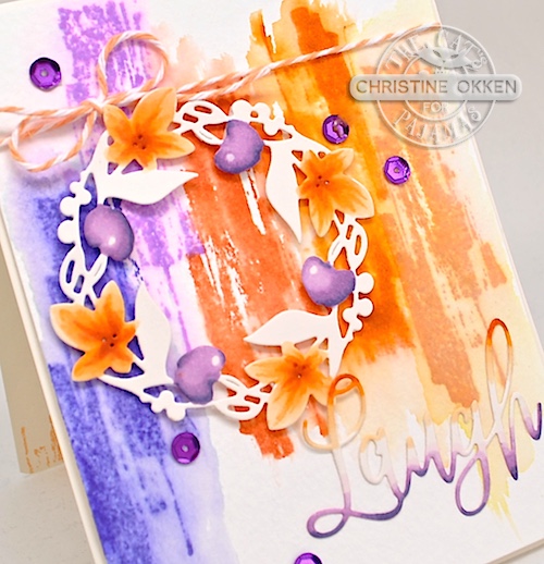
I wanted to do some more experimenting with our cool new set, Watercolor Basics, because it just lends itself to trying creative things.    I started by taking a panel of watercolour paper, using my water brush and adding water to the paper.  I let it sit so it was damp but slighly soaked into the paper, and then I stamped the sections of colour with the stamp.  This allowed the ink to bleed slightly.  I picked up colour from the stamping with my water brush and spread it around a little more to really give that soft wash look.  I did this with some sunset colours along the panel.   

Next I die cut the Spring Wreath from our Easter Release as an accent, coloured up some of it to match the watercolouring using Copics and added it to the design.  


I also die cut the sentiment from our new CutUps Die, Live Love and Laugh, and just trimmed out the “Laugh” part of the die.  I added some sunset colour on each side of the word and blended toward the middle.  Just a bit of twine and a few purple sequins complete the design.  


On the inside, I added a sentiment from TCP’s set Friendship, because it worked so perfectly with the outside sentiment.  I stamped the same stamp from the outside of the card inside the card.  Without adding the watercolour wash that I did on the outside,  it has a very different look.  Another way these stamps are so versatile.  

We’re also kicking off a month long Customer Blog Hop today.  Check out the TCP Blog for more details.  It’s a way for you to use your new goodies and be entered to win some Cat’s Cash for the store!  

Now I’m going to send you off to Julie’s Blog for more beautiful and creative fun!  


Friday, April 21, 2017

Sunset Sway


Another treat for you today with a beautiful new digital image from Power Poppy!  This one is called Sunset Sway, and no I’m not dancing, but the flowers are :)   It combines some lovely Clusiana Tulips and Wild Anemones together, and you have the choice of the scene with a butterfly or without!  I chose to just let those blooms shine without the butterfly.  

I picked a bright and sunny colour combination and also used one of our Power & Spark Sketches for this month.  Have you played along yet?  Theres just a week left!


Because I needed another thank you card for Administrative Professionals Day next week, I used the sentiment from Power Poppy’s set, Burst of Kindness.  


Here’s another reminder about the challenge this month.  Some great sketches to choose from, and you could win a Power Poppy set of your choice, just for playing along!

Pop on over and see what the rest of the Bloom Brigade has to show you today!  


Allison Cope
Christine Okken
Stacy Morgan
Tosha Leyendekker


Now....before you go, have you heard our 3rd Birthday Celebration news? Woo Hoo!


Tuesday, April 18, 2017

TCP Sneaky Peek Extravaganza!


Wecome to the April Sneaky Peek Week at The Cat’s Pajamas!  We’re running things a little differently for Sneaky Peek week now and each of the designers get a day to show off the April goodies.  Today is my day, so I’m excited to show you three designs that showcase all the fun items coming your way this month.  You’ll definitely want to check the TCP Blog each day to see which designer is featured and you can so that you can see how each person used this month's great new products.  

Let’s jump right in with what’s new!  

We’re kicking it off with a sweet design using the new set called Bunnies In Flight.  Seriously SO cute!


I thought it would be fun to use this adorable bunny and dragon pair for a baby card.  I started by stamping our bunny with gray ink and colouring him up, and his dragon, with Copic Markers, then trimmed them out with a wee bit of a border.  

All put together with a fun layout with an "open-front-peek-through” design, which showcases the new and dreamy Clouds and Balloons CutUps die.  


Here’s a close-up look at our “How to Train Your Dragon Bunny”.   The fun sentiment from the set  really makes the brand-new-baby theme work.  A few enamel dots, and some baker’s twine complete the design.  

Here are the Copics I used below.  


Next up is a celebration for Cinco De Mayo!  I have such a love for all things Mexican.  If you’ve followed me for long you know that we have taken a group of high school students and leaders to Mexico City to serve at two Churches every other year in the summer.  Our friends there mean so much to us!  

One of the highlights of each trip on our day off is to go to a place called Xochimico in Mexico City,  (I’ve linked an article about it).  It’s a borough of Mexico City that is full of canals;  one of the things you can do there is ride colourful boats along the canal pushed by a boat driver with a long pole. It’s acutally a Unesco World Heritage Site.  As you’re floating along the canal, boats of mariachi singers will come and serenade you.  It’s so fun!  This card is a bit of an homage to that sweet memory.  


This set is a re-release of the an older set from TCP called Hola Tequila.  I coloured up my adorable little mariachi band with Copics and then placed them on a panel of chevrons created with TCP’s CutAble,  Chevron.  

Next, I added some black banners to ground the image and then added the pretty flags from our County Fair CutUps die, to make it really feel like a Mexican party.  


Completed with a couple of enamel dots and pearls, and the Hola sentiment.  Here’s the Copics I used below.  


Now for the last design, we have a fun new set called Watercolor Basics.  It is full of great elements to create watercolor splashes, swipes and brushstrokes.   You can use in countless ways in your card making.  So many possibilities for backgrounds, accents and focal points with this set!


This design is a bit of a departure for me because it has elements of grunge and multi-media, but put all together, I think it works in a creative way that feels full of life!

I stamped the two of the splash elements of the design (larger and smaller) in a diagonal pattern down the cardstock in a fun colour palette.  Next up,  I took some washi tape, vellum and some of our TCP Butterflies in each of the colours to accent.  


I also used our fun new CutUps die, Live, Love and Laugh layered together twice to give some dimension.  I think it’s a cheerful, lighthearted design.  


Here’s a peek at all the fun things we’re releasing this month!


Now it’s your turn!  Comment on all the designers blogs this week and you could be In It To Win It!  You’ll be eligible for a $10 Gift Certificate to the TCP store!  You can find out who’s up each day at the TCP Blog.


I’ll be back with more from these fun stamps and dies next week!  Thanks so much for dropping by!   

Be sure to stop by and see Wendy tomorrow for all her Sneak Peeks!


Save

Friday, April 14, 2017

One Cool Chick


I’m dropping in for the Power & Spark Challenge for April and it’s a Sketch Challenge from Julie, and even better, you can choose from 3 sketches!  


I chose the work with Power Poppy’s new set Succulent Singles colouring it up this time with Copics.  I love how pretty this set is!  I coloured up three different succulents in some different palettes, and then cut them out.  Then,  I placed the in an arrangement I liked on the panel, and once I found something I liked, I added some stamping of some more of the baubly looking succulents in the background.  

Here is what this sketch looks like below:  


A bit of a closeup shows the twine, sequins and paper I added to pull it all together.  


Here are the Copics I used.  


Pop on by the Power Poppy Blog and pick a sketch for yourself and join us!  You could win a Power Poppy set of your choice!

For some more lovely inspiration today check out my Bloom Brigade sisters:

Allison Cope
Christine Okken (
you are here)
Cindy Lawrence

Julie Koerber


Wednesday, April 12, 2017

Easter Lily


Hello lovely people!  Today I’m bringing you a special design made for Easter.  It is so meaningful to me in my faith walk to remember and celebrate Jesus sacrifice for me personally, the depth of His love for me and for the world, and hope for life!  The Easter Lily is a symbol of purity, virtue, innocence, hope and life.  Perfect for the season.  

I wanted to see if I could use Power Poppy’s beautiful new set Tiger Lily XL to create an Easter Lily, and overall, I think it worked pretty well!  It’s always nice to find more than one way to use a stamp.  

I started by stamping the large lily in Memento Summer Sun ink on Copic XPress It Blending card stock.  The light ink helps maintain as much of the white of the petals in the design as possible.  Then, I went to work colouring in the center of the flower in a bright green, next adding shadows to the petals in the depths allowing a lot of the white to show through.  By colouring the background in a bluey-purple it adds to the contrast, making the whites look even whiter.  


I decided to keep the design very simple to showcase the beauty of the flower.  Just adding a simple row of ric rack and the sentiment from Power Poppy’s set, Bloomin’ Wonderful stamped in Memento Pear Tart ink.  

Sometimes when I’m colouring a really large flower, I’ll cut off the edge of the design and flip it around to the opposite side of the card to add some contrast to the design.  You can see this little strip along the right side of the card.  It was originally on the left of the stamped design.   


Here are my Copics used for the colouring.  


Thanks for sharing the joy of the Easter celebration with me.  I’ll be back tomorrow with a card for Power Poppy’s Power & Spark Challenge!


Friday, April 7, 2017

Power Poppy & Misti Blog Hop!


Happy Friday everyone!  Today Power Poppy is pairing up today with My Sweet Petunia for a fantastic Blog Hop showcasing the amazing Misti stamping tool!  

I am so delighted to have this nifty tool now because it makes stamping so much easier, so much more professional and polished, PLUS you can do so many cool things with the tool, so it expands your stamping as well.  

Today I have two cards showing a similar technique, done two ways with different mediums.  

One of the things I appreciate most about the Misti, is how precisely you can stamp your images.  If you don’t press hard enough, you have a really large stamp that needs extra coverage or a solid stamp that needs filling in and it doesn’t work the first time, your Misti comes to the rescue!  You can re-stamp the image to perfection. No worries about the image not lining up properly.   I’ve found that you can use this to your advantage with techniques as well.  

First up, I’ve done some stamping using one image in multiple colours.  


On this clean and simple spring design I used Power Poppy’s gorgeous new set, Peony Muse to make a pretty peony garden.  I love the variety of colours peonies come in and with the Misti, you can stamp an image multiple times adding different ink each time.  This leaves you with a multi-coloured image, like a multi-coloured peony.  First I stamped the peonies fully inked in Memento Canteloupe.  Next, I inked up just part of of the peony stamp in Tangelo ink, stamped it, and then finally, I inked up a little less the of the stamp in Lady Bug ink.  All you need to do is swipe your ink pad slightly over some of the areas of the stamp and then press down on the paper.  


I used the same technique with the leaves using Memento Pear Tart ink and then Bamboo Leaves.  


I also used the same technique with the lovely sentiment.  The design is finished off with some Baker’s Twine and clear sequins.  


Next, I used the same technique for a watercolor style. 


With the same peony stamp I inked the blooms with a waterbased ink (SU - Purely Pomegranate) on watercolor paper.  Then, I used my waterbrush to pick up the colour from the stamp and wash it in, colouring the petals.  By doing this you lose some of the details of the stamp, which is nice for a soft effect, but if you want to add the details back in, all you need to do is wait for the paper to dry and then restamp the peony with Purely Pomegranate ink again.  


Here you can see the peonies watercoloured and then restamped with ink for the background layer.  I added in the centers of the flowers with a black sharpie to coordinate with the colours I was using for the card.  


For the accent flower you can see above how I’ve washed in the ink to give the bud some colour and below, I’ve stamped it one more time to add in some of the detail lines.  It’s subtle, but a good effect.  


And here’s a closeup of the card with a layer of vellum, a pretty sentiment from Power Poppy’s set Artful Display, and then some sewing, sparkly ribbon and some enamel dots.  


Now for some more fun!  We have prizes on this fun hop that you’ll want to get in on!  

All you need to do is leave a comment on each blog for a chance to win the Power Poppy giveaway (one of 2 $25 gift certificates) and the MISTI giveaway (the winner's choice of original or mini)!

MISTI Winners will be announced on this page of the My Sweet Petunia blog on April 14th. (Please include this link)  Power Poppy Winners of (2) $25 gift certificates will be on the Power Poppy Blog on the 14th. 


Thanks for stopping by!  I know you’ll find much more amazing inspiration along the way.  

Save/span>

Monday, April 3, 2017

No Coffee...


We’re back with a new challenge for the next 2 weeks at The Cat’s Pajamas!  This week we’ve got a fun challenge called “A Little Bit Sassy”.  TCP has some fun sets and sentiments that would fit perfectly for this theme.  This week I pulled out TCP’s set This Could Be Vodka.  I stamped the cutie patootie cat in his cup, including the added little cup accents with Memento Tuxedo Black ink onto Copic XPress it Blending cardstok and aftern colouring with Copics, I cut him out.  

For fun I added the notebook border with TCP’s CutUps die Toppers CutUps, and then placed my kitty cat onto circle using the Framed Up 2 CutUps die.  The sentiment is perfect for all coffee lovers and our sassy theme.  


A few little touches of white sharpie accent his markings and a bit of twine and buttons finish it off.  The layout is this week’s Mojo Monday layout.  

Here are the Copics I used to colour it up below.  


So jump on in with us in the challenge....you could win some TCP Cat’s Cash to use in the store!  

Here’s some more inspiration from The Cat Pack....


Save Brenda Nakandakari
Christine Okken (you are here)
Jessica Rone
Wendy McGaffey
and Alma at the TCP Blog!